

Building an accessibility-first drag-and-drop design system
Design System
UI Design
Accessibility
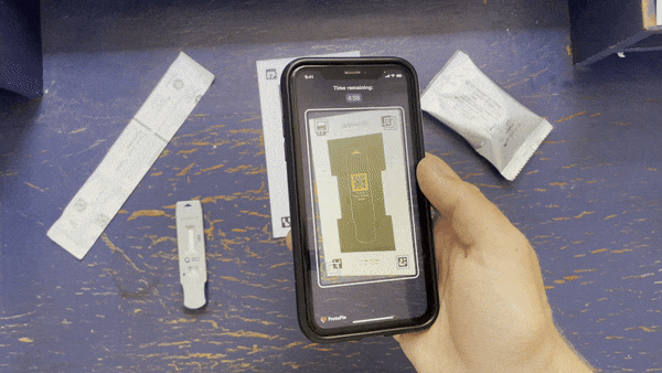
In 2020, Scanwell partnered with BD to expand our at-home diagnostic product to support COVID testing. This created a need for a unifying product language that could support multiple testing workflows within a single app.
We took this opportunity to overhaul the design system as a whole, codifying accessible design standards throughout the style definitions and components.
Collaborating with design, engineering, and QA teams on this new system also revealed a need to refresh internal processes that would ensure all teams stayed in sync throughout the design + development steps.

Challenge
Improve accessibility and consistence of the app interface and reduce confusion for the development team.
Strategy
Build a design system that has WCAG compliance baked in and acts as a single source of truth for the developers.
Auditing the exiting product
To understand what this kit would require, I started by cataloging all of the buttons, colors, patterns, etc. in the existing app, as well as some of the conceptual wireframes our team had begun building for other testing use cases (e.g. COVID).

Defining universally compatible styles
I then defined a set of colors, fonts, and styles that align with BD’s brand guidelines and conform to the WCAG’s accessibility guidance on character size, line spacing, color contrast, etc.
This created a reliable foundation which we could build a more accessible product from.

Nesting component system
While building this new design system, we made sure that the parent Figma file was structured in such a way that when changes are made to the foundational elements, these updates immediately propagate across all instances of the system.
This way, as we began to implement the system and unforeseen use cases emerged, colors, styles, and components could be seamlessly updated throughout the design.

Reusable screen templates
Following a suggestion from the engineering team, we created a set of responsive templates that can accommodate the majority of the screens in our workflow.
This ‘declarative UI’ helps make development of the designs faster, less resource intensive, and less error-prone.

Documentation + handoff process
It became clear that inconsistencies in the way designs were labeled, organized, and updated resulted in a communication breakdown between the design and engineering teams.
To resolve this, we also defined a standard procedure for reviewing new concepts as a team throughout the design process and documenting final changes for hand-off to the engineering team. This also later proved valuable in disclosing app release updates to the FDA.


Outcome
Rapid build, reliable output, more accessible experience
Clearly defining design guidelines and building a library of components and styles completely changed the way our team approached product improvements. The ability to drag-and-drop components made wireframing new concepts nearly seamless and guaranteed a baseline level of accessibility.
Working from screen templates cut development time in half, allowing us to rapidly generate functioning prototypes for usability testing of new features. Clear documentation meant fewer errors and less time communicating changes between teams, and more accurate updates for the FDA’s release audits.
Related Work
Becton Dickinson
AR · Prototyping · Product Design

Becton Dickinson